Identity (Ideating)
Book Specification
| Item Code: | NBZ859 |
| Author: | Anil Sinha |
| Publisher: | National Institute of Design, Ahmedabad |
| Language: | English |
| Edition: | 2010 |
| ISBN: | 9788192022109 |
| Pages: | 120 (Throughout Color Illustrations) |
| Cover: | HARDCOVER |
| Other Details | 11.50 X 9.00 inches |
| Weight | 960 gm |
Book Description
"Ideating Identity" is the quintessence of Anil Sinha's long tenure as a designer and as a teacher. -Ideating Identity" documents the identities he has designed at the National Institute of Design. In addition, the processes, the learning, the logic, and the art of communicating through identities are also documented. The book maps the terrain of a variety of questions: What is an identity? What goes into the making of an identity? How does the process flow in translating a concept into an identity? What are the challenges in designing an identity? Why is one identity more representative of a concept than another? In what ways does identity convey organizational strategy? "Ideating Identity" contains several examples of exciting concepts which have been given equally powerful identities.
This book is written in a clear, precise, minimalist, easy-to-read style. It serves as an excellent guide to the art of visual communication, in particular the art of communicating complex concepts through aesthetic, well-designed symbols. The value of this book lies in its usefulness to students of graphic design, practising designers as well as the common lay-person who may wonder what happens behind the scenes in the designing of identities and logos. In addition, in today's global scenario characterized by intellectual property rights issues and confidentiality clauses, it is refreshing to note that "Ideating Identity" openly shares ideas, processes and methods. This is because the ancient Sanskrit saying Vyaye Krute Vardhta Eva Nityam has strongly influenced Anil Sinha's professional and pedagogical practice.
The meaning of this saying is that knowledge increases in direct geometrical proportion to the extent it is shared. Rather than protecting the knowledge he has acquired, Anil has done his best to share his knowledge, which has been acquired over a quarter of a century working on various projects at the National Institute of Design. I am sure that "Ideating Identity" will serve as a source of inspiration for yet another generation of designers to devise new visual metaphors for complex subjects.
Challenge of Change
Centuries ago, before the written and spoken word, man was a truly great visual communicator. As our own artistic and cultural heritage testifies, we have symbols developed thousands of years ago that still hold power and prestige in our lives. Language or words have a limited scope for communication. Much remains unsaid after everything has been said. Some symbols can effectively communicate the message. A graphic designer's role is to get the message across in a similar way using visual tools. Prof. Anil Sinha has with great zest and humility successfully met this challenge of wordless communication. His gift lies in adapting metaphors to the changing times. Corporations as well as students will certainly benefit from the uniqueness of this publication, where it goes beyond displaying identities, as it reflects the systematic approach and process of creating the desired image.
Who are the real winners or losers? Corporations need to develop identities to project their image internally to their employees and externally to shareholders and customers to initiate the process of Corporate Image Design. Most corporations pass this acid test. The rest are either still discovering who they are or just making stories as they go along, periodically falling flat on their faces. The real big winners are the ones that have honed the right image to fit their story. That is why the right image to fit the right story is critical.
Vision to look beyond Rather than acquiring the image by default, why not do it by design? While directing the destiny of the organization one has to fit the right story to the right image. Corporate image demands a clear-cut strategy, a mission, a game plan and an interesting script. That is all that needs to be expressed. What is the corporation all about, what does it do, and where is it going and why? It is true that most corporations these days are usually wrapped-up in some big generic business concepts with the very common quicksand of shortcuts. The reality is that markets are moving and changing too fast in too many directions. No matter what the corporation does, it must project a sharper personality, something that requires professional and result-oriented assessments, not just trendy ideas. That leaves little room for false claims or overtly silly and wildly humorous image campaigns. Money and business both are serious issues. Customers and shareholders alike want to do business with the teams that take their brand image seriously and not the 'take-me-as-I-am' bunch. Lastly, the corporate image and brand name identity adopted by a corporation must be exclusive and unique so that it is not something that is either predictable or pedestrian. The effort put in this valued compilation by Prof. Anil Sinha of some of the identities he has created is a major step forward in the graphic design field toward creating corporate brands with intense sensitivity. As well-designed identities should, they clearly tell us their story. I am sure this book will be of great help to students of design as well as young practitioners in the field.
A visual identity is a mark that at once reminds you of a product, a company, an organization, an individual or a service. It is a graphical representation that may encapsulate reams and reams of written text that explain the area of operation, the philosophy, the functioning and the expanse of a company. To use a much flogged phrase, a picture is worth a thousand words. The symbol or visual representation of a corporate entity can be called by various terms by people from different areas. A corporate relations manager will speak of a corporate identity whereas a military man would identify with an insignia, and an individual seeking a unique recognition mark may request for a monogram. Generally speaking, people are most familiar with either the term Symbol or Logo. If we define a symbol as a visual image that is created to represent the idea of an organization, it is a symbolic yet simple form that expresses the organization in terms of its activity and philosophy. We can speak of a logo, an emblem, a sign, a masthead, a monogram. What they all have in common is that they represent and encapsulate the graphic form of an identity. A logo is defined in the simplest terms as any symbol that is initially accompanied by the full name of the organization. It is designed in a specific style to go well with the symbol. Like the symbol, this cannot be changed. It has to maintain the same style. In most cases of application, the symbol and logo appear together.
The symbol and the logo together form the identifier. Symbols can either be logotype or visual abstractions. Sometimes the symbol is in the form of a logotype where the visual image is created by using the initial alphabets of the name of the organization. The alphabets are put together in a way that besides merely reading them one is able to perceive them as a form as well. This form, created with the help of letters of the alphabet, in turn helps to project the idea behind the organization. This is generally used by organizations that want to be known by their initials. A visual abstraction is a symbol that projects the image of an organization through a visual form. These forms are not illustrative representations but tend to be abstract and simple. The design solutions in such cases suggest the philosophy of an organization in abstract terms. Simple forms are used for better retention and recall value. In the case of a detailed corporate identity system, it is not enough to create a logo or a symbol. It is also essential to create a complete system through which the symbol is repeated in a consistent and systematic manner-for example, on letterheads, glowsigns, product packages or corporate signage. A corporate identity programme thus helps to create a stronger image of an organization each time the image is expressed to its audience.
A design manual is made to give specifications facilitating consistent and quality production of all items that carry the logo and symbol. The main function of the manual is standardization of style, size, colour and orientation of the symbol and the logo in the context of its use. Thus it helps reprint or reproduce the visual image consistently and correctly for the organization at all times.
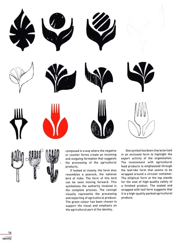
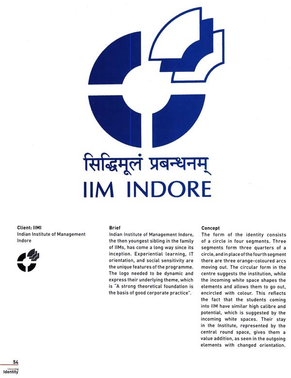
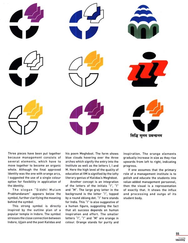
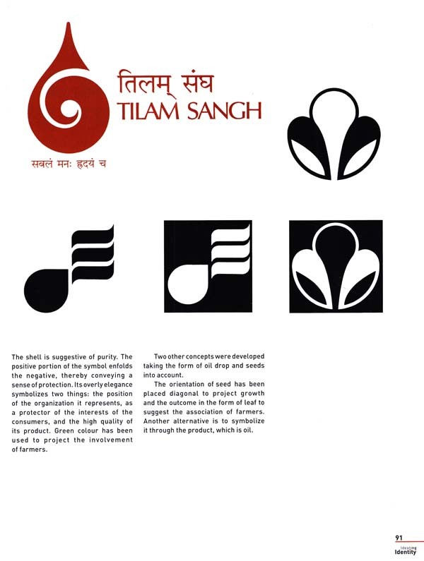
Certain symbols stay strongly entrenched in our mind and even as a multitude of visual images are bombarded into our brain, they hold their place, clear and concise and with instant recall. As a designer one can analyse, appreciate and assimilate the parts of a symbol that in graphic vocabulary convey the message of a corporate identity. But seldom, if ever, do you get to retrace and tread the creative path that the creator of a symbol, a logo, a masthead has taken to arrive at the final outcome. This book shares the ideas and ideating methodology that have been a part of the process of creating some well-known and well-recognized logos from the creative collection of the author, Anil Sinha, as a part of institutional consultancy at NID over the years. They not only show the linkage of the client and the final identity, but also give a glimpse of the path and method that was used to arrive at the final choice. There is no fixed formula from the client brief to the final visual identity created by the graphic designer. To arrive at the final outcome, the designer must understand the name, the corporate vision and mission statement, the product profile, the company philosophy and the kind of image they want to project. There is also the onerous task of separating the grain from the chaff from the material the designer may be inundated with. At other times, the input given by the client may not suffice. There may be a need for additional information through interaction with more people.
It helps to know what the company stands for in the minds of employees, not only in the top creamy layer but also the people in different rungs of the corporate ladder. Perhaps the most important aspect of the work is the belief that everyone is searching for a unique identity, and the challenge that faces the designer is that this identity must be communicated to the consumer, bearing a plethora of factors in mind. Who is the user, who is the communicator, what is the identity attempting to communicate, what impression does the client want to leave in the mind of the viewer? The challenge is to create not just one but a number of options for the same brief where each of them represents a suggestion and insight rather than a literal or direct representation. It is not enough to come up with just one idea based on the client brief. As a designer you have to give the client an opportunity to finally select an Identity of their choice which they will feel proud of. Design, after all, is about connecting and relating to people. As designers we need to connect and the users need to relate to the designs we create. An identity is a visual that is to be perceived and interpreted. It is an abstraction of the values and philosophy it represents. Ultimately, the symbol that works is the one that easily communicates the idea to most people. Visual identity is often referred to as the face of an individual, society, or corporation. The creation of the visual imagery and the iconology constitute a visual identity. This book is an attempt to present the process of generating and representing the ideas for identity: Ideating Identity.
**Content and Sample Pages**

